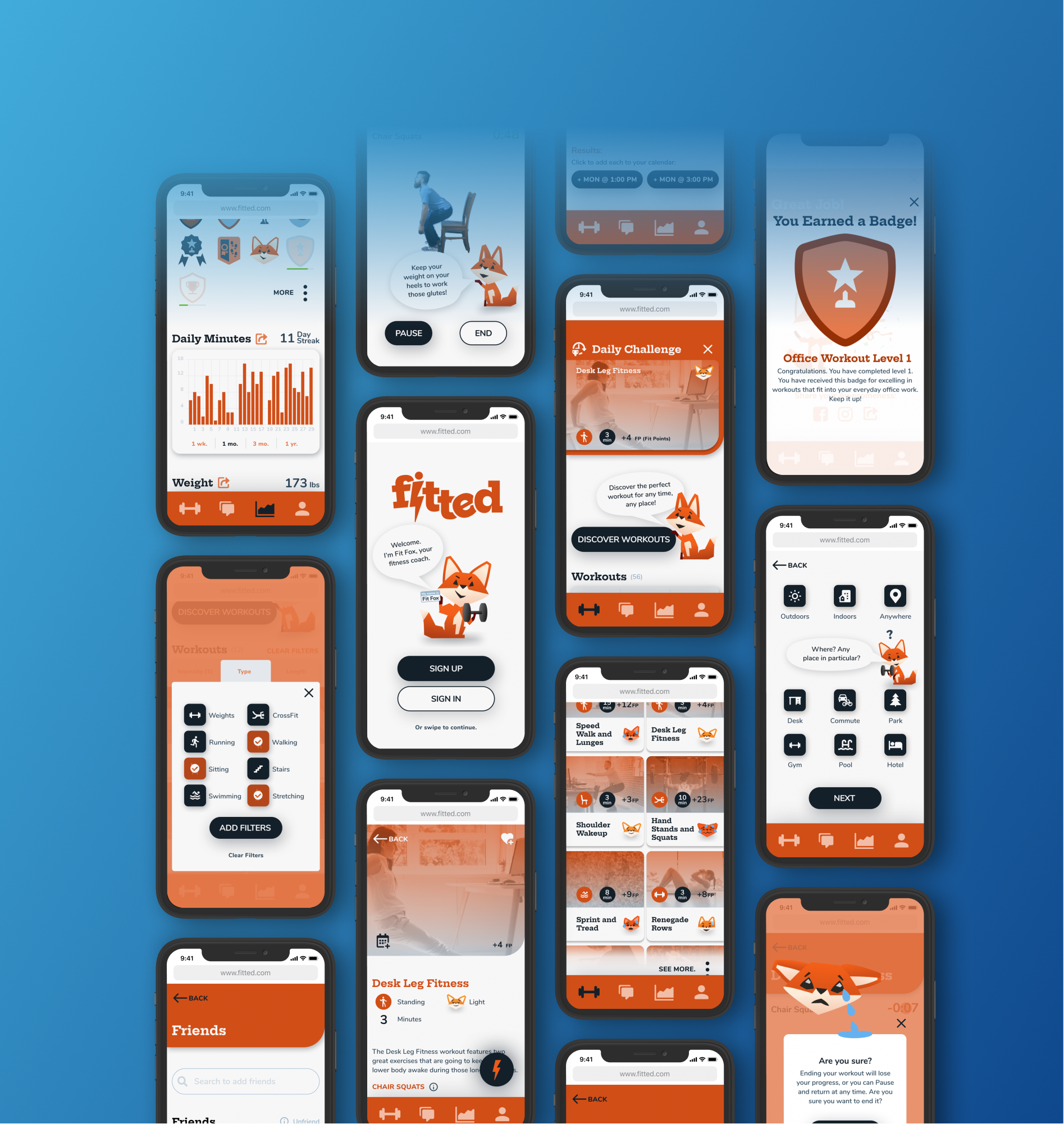
Read on

Fitted

A UI Design Case Study

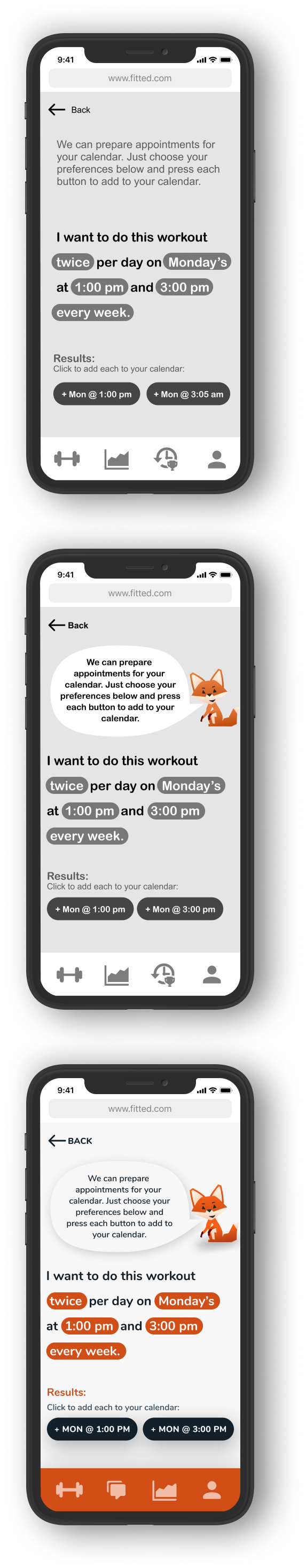
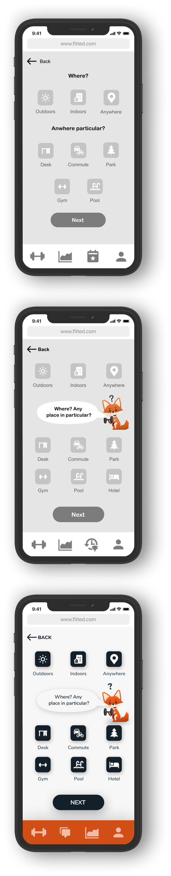
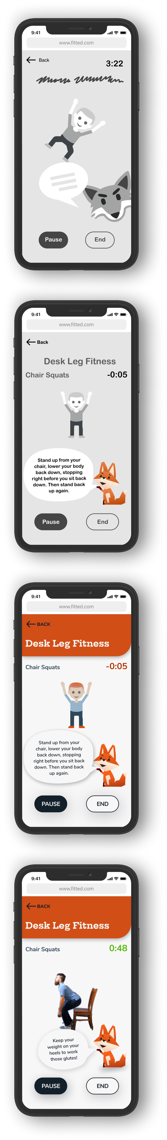
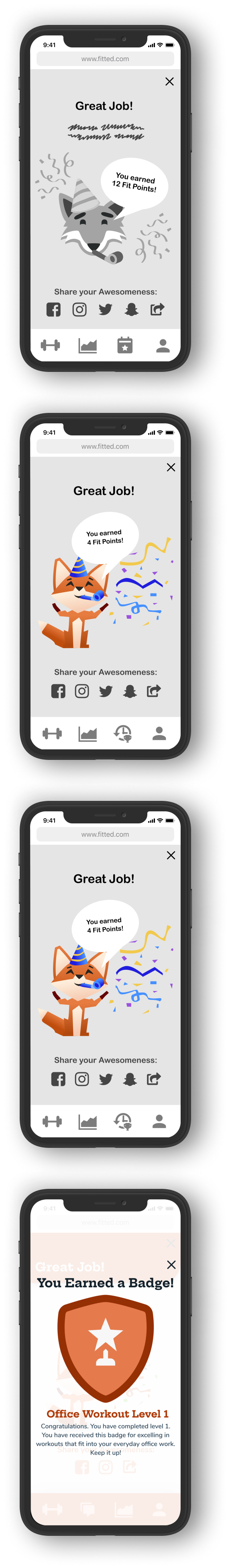
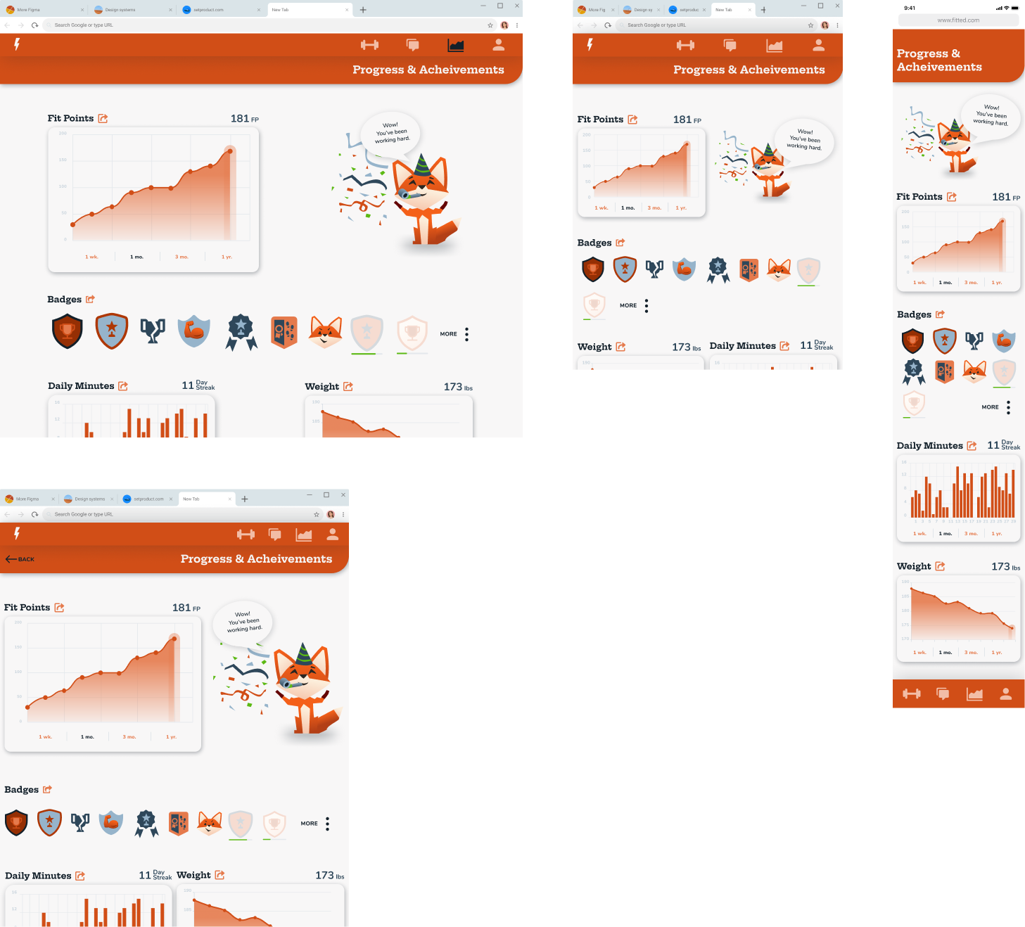
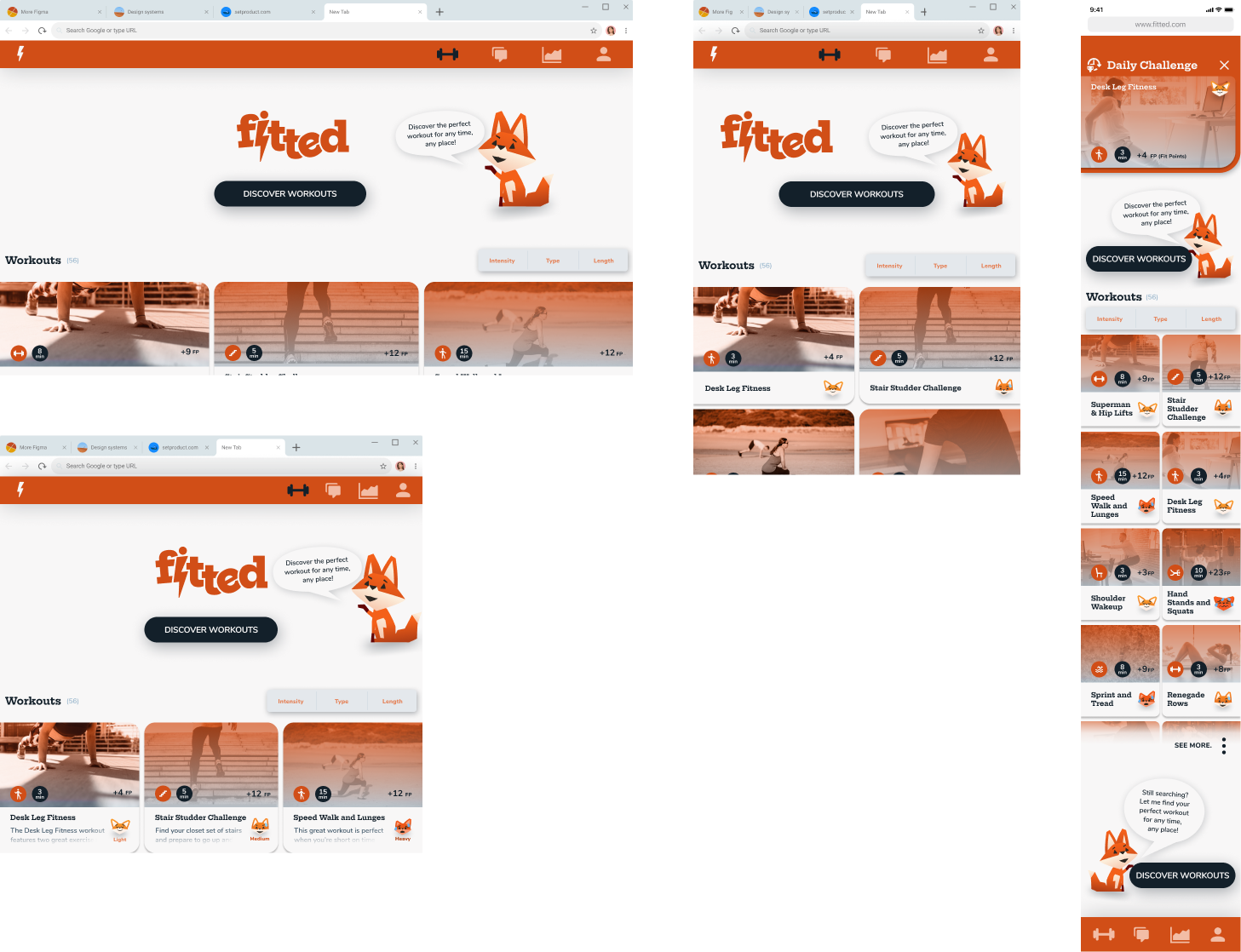
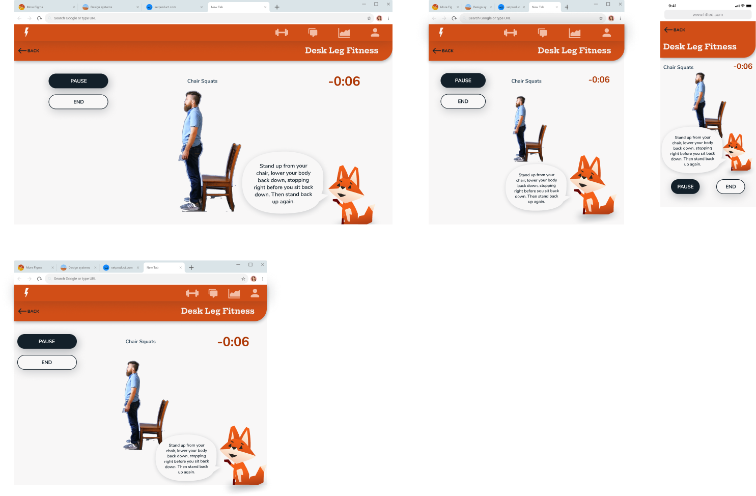
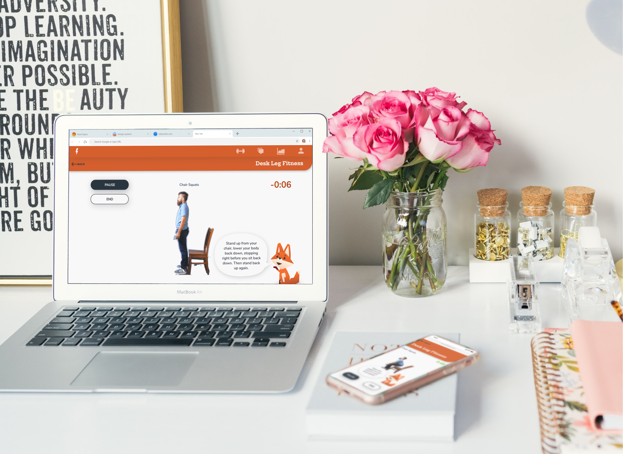
Productive people by nature fill their schedules to the top, and they often fail to prioritize their health and wellness.

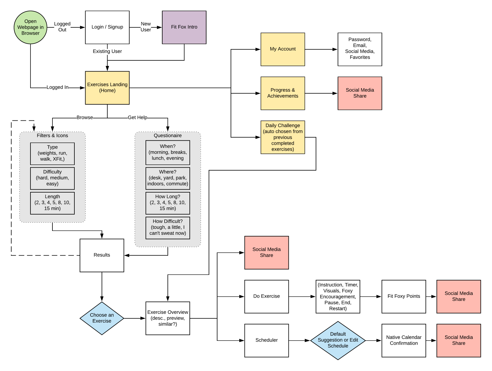
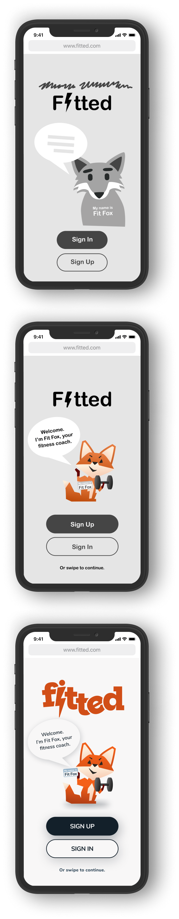
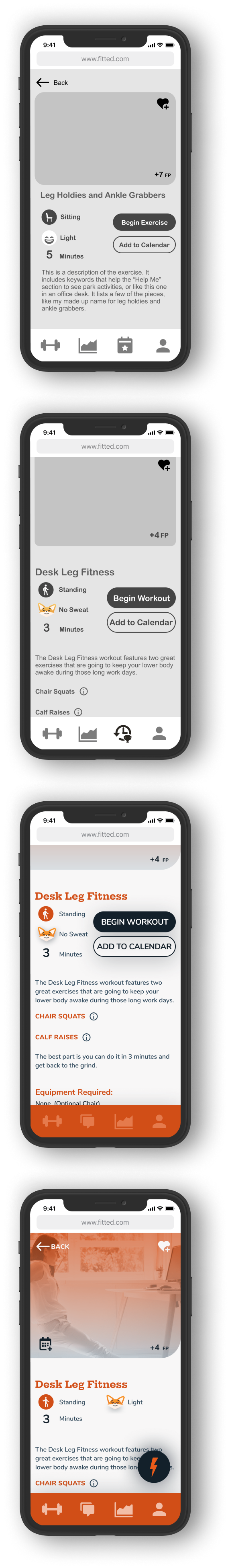
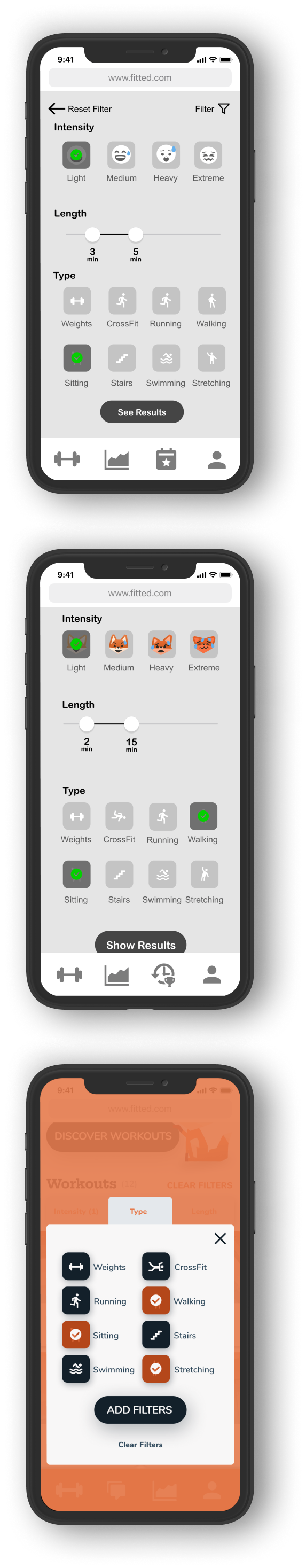
As lead UI designer on an website called, Fitted, I made it easier and rewarding to ‘fit’ in small workouts throughout any busy person’s day.

This case study is a result of my work through CareerFoundry’s UI for UX specialization course.

Read on

My Role

For this project I focused on the design of the User Interaction (UI), rather UX.

I was responsible for desinging the userflows, visuals, icons, typography, device responsiveness, and everything up to asset and design handoff to developers.

While the course is designed to be done in about 3 months, I completed it in 6 weeks.

Read on
View more
View more
View more
View more

Design Brief

Some of the User Experience design phase was already completed and provided in a design brief.

Here you can see the persona, Rebecca, and the User Stories, Required Features, and the few Branding Guidelines provided.

Read on
View more
View more
View more
View more

User Flows

My first step was to develop a user flow that would meet the design requirements and give great user experience to Rebecca (our persona). Having experience in UX allowed me to easily get to a simplified and “happy path” for an early MVP to wireframe and test.

Read on
View more
View more
View more
View more

Wireframes
and Testing

The early wireframes focused on layout and heirarchy based on Rebecca’s, the persona, priorities and my user flow. I developed a prototype to test with 2 target users and found many things to improve:

Information architecture for each workout took lots of revisions as the app centered not around individual exercises, but complete workouts for any level of user. That meant that each workout had a lot of variables and details that needed to be quickly and efficiently communicated without giving cognitive overload.

Here you can see the entire design progression for many of the screens. Starting from gray-scale at the top to finished screens at the bottom.

*Scroll each set of phones to see the progression
Read on

FitFox

From the beginning I felt the app and Rebecca, needed sense of intense playfulness. Despite the demands it would require, I began creating and developing a companion and coach for the website: FitFox. I took inspirations from other characters and designers and settled on the character you see here.

FitFox helps the user onboard, coaches along instructions during workouts, indicates workout intensity with different mood faces, and celebrates with you on your workout journey.

In later development, FitFox will be animated, but for the MVP this friendly kick-butt character will be your companion each time you visit.

Read on
View more
View more
View more
View more

Mood Boards

Before pushing to far into visual design with color, typography, or visuals, I considered two different options for the website.

The first was a little more dark and intense, with FitFox being engraved into the patina of exercise equipment. The second was more light and airy. It focused not on intimidating Rebecca with grit and sweat, but on simplicity of integrating Fitted into her daily routine.

As long as I was careful not to make the mood of the website too juvenile I went forward with Mood Board 2.

Read on

Style Guide

Developing typography, iconography, and color schemes happened at key points along the design process.

All told I tried about 10 different color schemes before settling on a simple two color scheme. Typography was an easier process and I settled on Nunito and Hepta Slab.

For the many workout and questionnaire icons, I used mostly rounded outside corners but maintained sharp inside corners.

Checkout the style guide here.

Read on
View more
View more
View more
View more
View more
View more

Interaction

The website features many intuitive gestures and sounds for easy navigating on mobile. It also has animation pieces that help Rebecca navigate and quickly find what she’s looking for in a fun and pleasant manner.

*Check out a few of these interactions in the video.

Fitted is a website, not an app, so the user can quickly swipe off the off the log in splash screen.

See the composed a video animation of the key animations and gestures on the landing and workout screen.

During the last three seconds of the countdown to each part of the workouts there is a simple beep and then a bell to start the timer on 0:00.

When the workout ends if you have a badge earned, it slides up, you can easily dismiss it by swiping it back down.

Each banner with a back button and arrow can also be swiped back.

You can swipe to remove workouts from favorites and friends from Friends.

Read on
View more
View more
View more
View more

Breakpoint Design

My approach to design was mobile first, but that does not mean mobile ONLY. I had been sketching desktop sizes since the initial wireframes.

Although the primary use of this will be found on mobile, there's plenty of use on desktops for all the workplace workouts. Here you can see some of the main pages through various breakpoints.

Read on

Final Design

You can see much of the final product and it's interactions by walking through the prototype. Additional mockups are seen below, as well.

*You can interact with this prototype.
Read on
Read on

Reflection

I am very satisfied and proud of the Fitted workout website. I can clearly see it is unlike others and offers a different way of integrating small workouts into your everyday busy life, especially for beginners or skeptics.

Building the Fitted website was a great experience. There were many times I would feel stuck and cluttered, but I really grew into the habits of seeking out inspiration from others. Seeing ideas from Dribbble and other UI collections allowed me to plan, create, and tackle almost all of the problems that came up.

Through much of my training I've had many plates spinning and it often felt as though designing was challenging enough, let alone communicating the design. But with this design/build I was able to focus in and still maintain motivation to communicate the design well. I can see it even in this presentation.

Walking through the UI for UX course there weren't a lot of surprises or new concepts, but it was intensive practice and repetition. I sensed a new level of confidence in my skills as each piece fell into place. I am excited to continue helping businesses and individuals with all that I have improved upon!

View Other Creative Design
UX Case Study:
GetXpert App
christ little rock dot com website screen shot
BeINN App
InnoDays Challenge
Video Teaser:
Fear or Faith
U.S. currency artwork with big heads that says money money money
Documentary Teaser:
The Church of Good
the church of good talking head sort of interview example
Back to Top